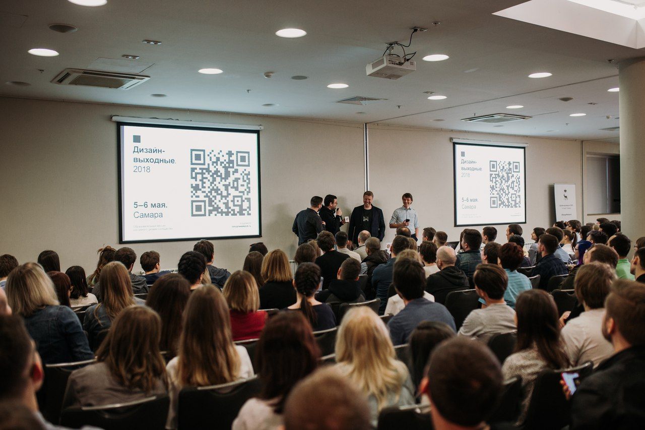
Design weekend is a truly unique event. 1500+ participants, 50+ speakers, free admission, four event venues and a very tightly packed program with no lunch or coffee breaks. The event is not-for-profit, which means economizing on everything except presentations – and, in the first turn, on printing.
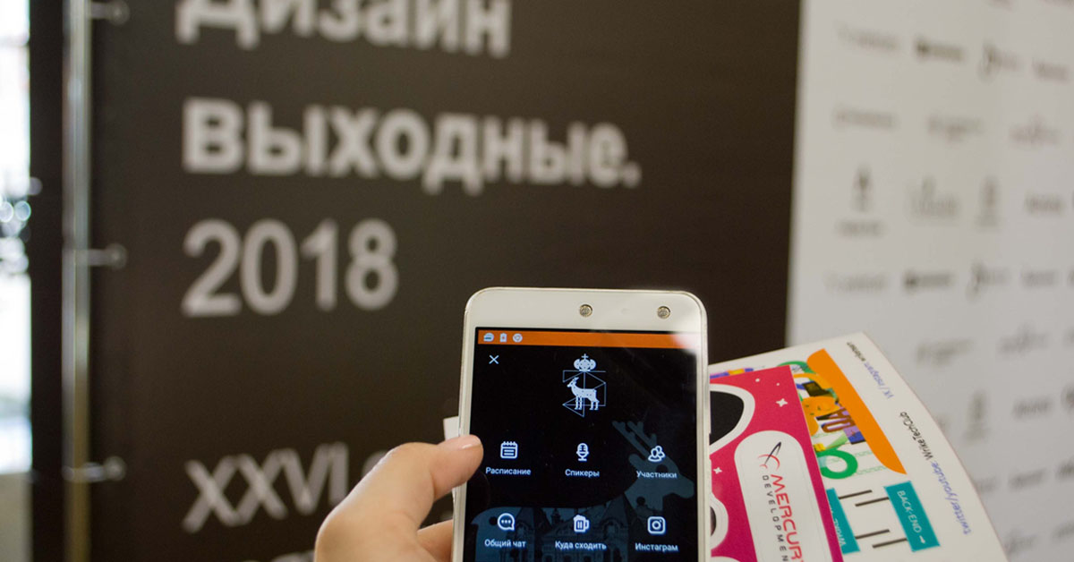
How can you hold such a large-scale event and completely eliminate paper handouts? How can you do without booklets, flyers, and printed programs and not lose out on the event quality? Actually, quite easily - if you have a mobile app.
“Printing costs were simply not included in the Design Weekend budget. We were hoping that our audience would be well-versed in digital technology, and it would be more convenient for them to get all information on their smartphones. And our expectations came true. The mobile app became the conference gimmick, its indispensable part.”
— Denis Kortunov, Design Weekend organizer
Everyone needs to download
To make sure that the mobile app provides an adequate replacement for paper handouts, conference organizers had to achieve a maximum adoption rate. The target was set: 100% of attendees must download the app.
The promotional campaign for the app started well before the conference, and so much information about the app was displayed around the event venue that no one could miss it.
Before the conference:
- A dedicated section on the official project website.
- Reminders to install the app popping up every now and then on social networks.
During the conference:
- A dedicated section on the official project website.
- Videos about the mobile app playing on the screens next to conference hall doors.
- Rollup with information about the app placed at the event venue.
- The app gets a special mention in the opening speech.
- When prize draws or competitions are announced, attendees are prompted to check the app for details.
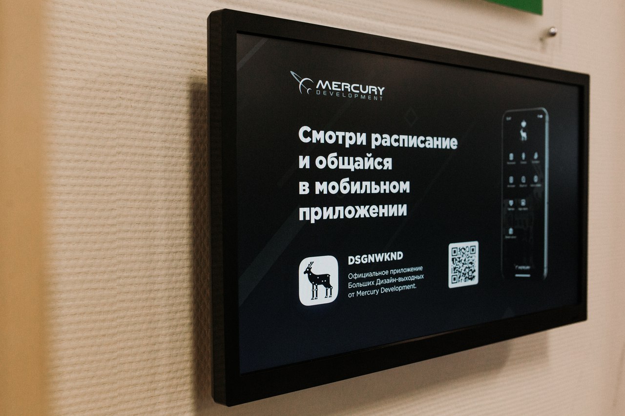
The result: the Design Weekend event app was downloaded 1531 times, while only 1480 badges were handed out at the conference! Even assuming that some attendees and speakers could sneak in without a badge, the share of downloads was very close to 100%.
Designer-tourist guide
“When we were discussing what sections we should add to the app, we thought about questions that attendees ask most frequently”, says Evgeny Demyanenko, who was in charge of technology in the Design Weekend organizer team. – “Obviously, the audience is most interested in the event program and speaker information. But many other questions come up: how to find a certain company, how to win sponsor prizes, or even where to find a good place for an impromptu afterparty.”
The conference gathered designers from almost 70 (!) cities. Considering the number of out-of-town visitors, we added a special “Places to go out” section to the app, with information about cafes, restaurants, and bars near the event venue. And to make it easier to find someone to go out with, we also added in-app social network.
Brand integration
Even not-for-profit events need sponsors. Or rather, not-for-profit events need sponsors even more than other events. However, events of this type don’t offer brands a lot of promotional opportunities: there are no swag bags, no booklets, no flyers or any other printed materials, and advertising at the event venue is very limited.
The event app, on the other hand, provides a lot of space for advertising, and Design Weekend organizers made the best use of the advertising possibilities offered by the Eventicious app. The general sponsor logo was presented on the main application screen, partner logos were placed on event program screens, and there was a special section titled Partners.
Also, a special section was dedicated to all competitions and prize draws that took place during the event. Each competition screen promoted a partner.
One of the main advantages of such sponsor integration is that it has a tangible result: the actual number of ad views, click-throughs and generated leads. For example, the “Program” section featuring partner brands was viewed 71,511 times.
Feedback
It is difficult to have a productive dialog with an audience of several hundred (even if it is divided into several parallel streams).
“Now I have ten minutes to answer your questions” says the speaker, and then helplessly stares at dozens of raised hands. People in back rows are not even trying to raise their hands – there’s simply no chance of being noticed.
This is exactly the situation that Design weekend organizers tried to avoid, while preserving the warm and interactive atmosphere. And this is where the Questions to speakers section comes handy. The audience can ask questions before or during presentations, or upvote questions asked by other people. So, when the time for the questions and answers part of the presentation comes, the moderator selects questions in the application and broadcasts them to the speaker.
This way, it is much easier to stick to the timing and control the content.
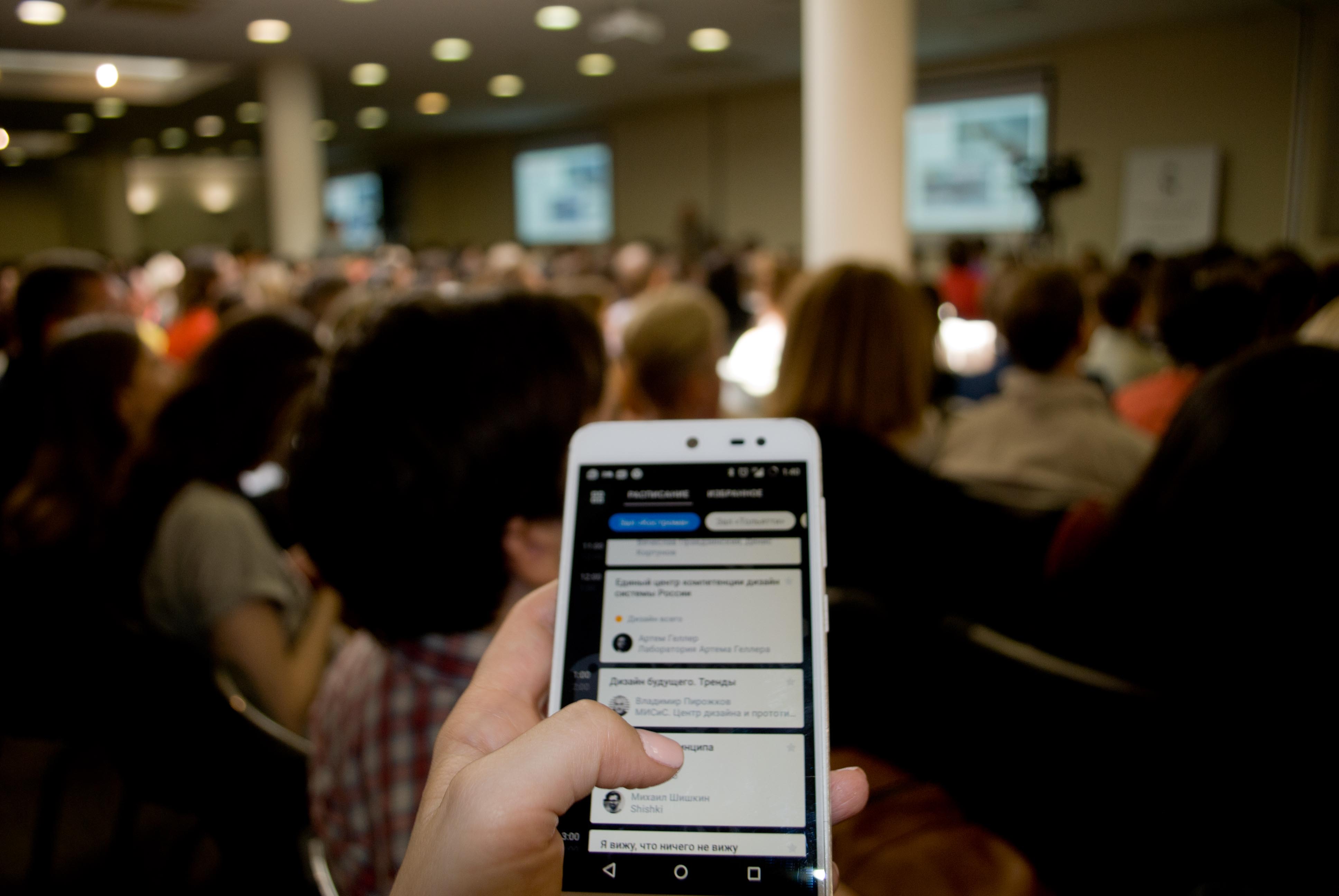
Instant notifications
One more task in which the Design weekend event app truly excelled was keeping everyone informed. Attendees received instant (push) notifications about program changes or prize draws at sponsor venues, invitations to the opening session and even event wrap-up.
For larger audiences, this is the most simple and efficient way to manage multiple streams and control the timing.
Based on their experience at Design Weekend, 91% of attendees gave a high rating to the event app. We think this is a very good result, considering that the audience consisted of designers, developers, and UX analysts, who are notoriously hard to please.
We could not find a single person who would complain about the lack of booklets or printed programs. Partners and sponsors were also satisfied. The organizers saved a lot of money, time and effort; now they won’t even think about holding an event without a mobile app.
